CSRD and Double Materiality Assessment Insights
CSRD, Europe's mandatory corporate sustainability reporting regulations, has adopted double materiality as its approach for companies to determine what environmental, social and governance topics to report. Here are some helpful insights on how to conduct a CSRD-aligned double materiality assessment.
Read More
Carbon Accounting vs Climate Risk: What's the Difference?
TCFD includes both climate risk assessments and carbon accounting among its reporting requirements, and understanding both domains is necessary for business managers to respond to climate change. This article aims to address some of those gaps.
Read More
What is the Network for Greening the Financial System (NGFS)?
The Network for Greening the Financial System is a network of some 75 central banks and 13 observers (as of 2020) to research and provide recommendations on integrating climate risk into the financial system.
Read More
What is climate-related financial risk and how is it managed?
Climate-related financial risk has raised alarm for leaders of the world’s financial system. Here is what it means and how companies and financial institutions are integrating it into their risk management and sustainability reporting processes.
Read More
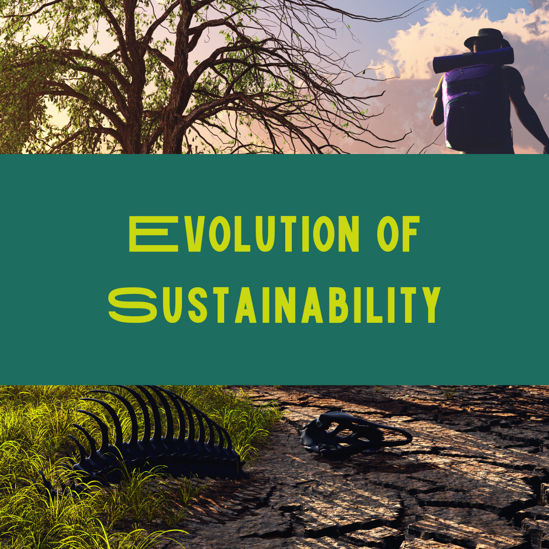
The ESG Evolution: A History of Sustainable Development from the 1970s to Today
Sustainable development, corporate sustainability and environmental, social and governance (ESG) practices have evolved rapidly over the past few decades. As the changes took place, new terminology has been developed to reflect divergences. Here are the waves of influence over how and why reporting and management practices are changing.
Read More
What are Shared Socioeconomic Pathways (SSPs)?
The UNIPCC's Shared Socioeconomic Pathways (SSPs) are mainstream climate narratives that portray different possible societal responses to climate change. Learn more about them here.
Read More
Climate Science: a complete guide to global warming
Scientists have found that humans have caused climate change, primarily from burning greenhouse gases. Here are the other possibilities they ruled out.
Read More
What is a Gigacorn? Climate tech investors explain
Christian Hernandez defines “gigacorn” as "a company that has achieved lowering or sequestering CO2 emissions by 1GT/year while being commercially viable." Is this even possible?
Read More
5 Women-led Climate Tech Start-ups Ready to Disrupt
Climate tech startups will become tomorrow's unicorns. I'm convinced they'll be women-led. Here's why.
Read More
Doughnut Economics: How sustainability got rebranded as a pastry
In this post, I explain why Kate Raworth’s Doughnut Economics makes such a great case for the planetary boundaries and SDGs as new goals to aspire to in the realm of economics. Her Doughnut Economics puts the triple bottom line on the map for a whole new audience.
Read More
What is green marketing?
Do you wonder: what is green marketing? In this post, you’ll learn that green marketing does not stop at eco-friendly cleaners and organic produce. By looking at its definition, history and broader implications, you’ll see that it has a much greater potential to change how business as usual is done.
Read More
How to use sustainability data to tell your brand story
By creating relevant sustainability data stories, a company can reach a wider audience, tailor messages to particular stakeholder groups and make sustainability an integral part of its brand identity.
Read More
How to use sustainability jargon without losing your audience
Phrases like "natural capital" or "ambition loop" may cause confusion, or even irritation, so it's best to err on the side of caution. Unless you can effectively communicate the benefits of such concepts to different audiences, the terms alone will not necessarily help persuade your audience.
Read More
How to build trust with sustainable branding
Consumers are well aware of the role businesses play in sustainability, and they exert influence through their pocketbooks. This is why it is crucial to build trust by developing a sustainable brand message for your business.
Read More